


 |
| my original sketch, from two years ago |
 The other big challenge for the sign was creating something that would survive the elements of a northern beach. I have finally developed a technique for mailboxes using silicone to attach the china, which allows for expansion in temperature changes. But that is on steel. I would need to base the sign on wood; and wood and weather don't mix. I knew from you-tube videos that there was a product that I could coat the wood with to repel moisture, but it took me more trips to Lowes to actually FIND this product than I care to admit. I was thrown off the hunt because the video I watched showed a product that was pink when wet and dried purple and this product was green and turned a darker teal when dry. Also, the product in the video appeared to be rather gummy and this was more like a finger-paint consistency. And sidenote: after asking literally dozens of male salespeople for help in finding the product, it was a female worker who finally helped me find the product I needed, which had been under my nose in the flooring department the whole time. (Sensitivity training in home-stores should be required. I can't tell you how many times I've been asked just what "my husband's project" is. A little pet peeve I should write about in another post. I digress.)
  With a suitable weather-proofing agent found, I could use a simple birch board as the base for the mosaic, instead of a cedar board, which I couldn't find in my local home-store in the dimensions I needed. This kept the sign from being too thick and too heavy. I should note that in hindsight, I wish I had attached the eyehooks for hanging at this point, but I was still shopping for sign holders at this point, and was uncertain about the placement. I ultimately decided that there were more sign-holder options than sands on the shore and I decided to just make the sign and let the sign-holder be a secondary project.
 Next came the layout plan. Since my original sketch did not include all of the words that my friends wanted on the sign, I needed to do a lot of tweaking. The color of the water-proofing agent really distracted me and more than once, I thought about painting over it with white paint just to help me with the layout. Everyone always asks how long a mosaic takes to make, and this is the time I always think of when they ask. It involves a lot of moving things around, standing on chairs and squinting. In this case, several four-hour sessions passed before I landed on a layout I deemed suitable. It needed to be friendly, but not juvenile or crafty; and it needed readability without sacrificing beauty. It should feel like a beach-cottage without being cliche'. Finally, it needed some structure, or else it was going to be the worst thing ever... boring.
In studying the inspiration signs we first looked at, I noticed a star as a nautical motif that wasn't completely overwhelming and it provided the structure we needed. Drawing a star on that scale really made me wish I had paid more attention in geometry class. I finally abandoned my ruler and compass and went with free-handing and eyeballing. You

This started the exploration of color and pattern that would have me trying on dishes like my daughter tries on outfits in the morning. More standing on chairs and squinting, more questioning the universe, and second guessing my life-choices and abilities. This is the part of the project when you are fully convinced that you are over your head, you will never make this work, and you have made a huge mistake.
So you eat some chocolate and keep at it. You can give up at this point and take a break, but I have found that this is pretty much the moment when success kisses failure. If you walk away, you only prolong the agony. Better to breathe through the pain and hope the labor isn't too long.
 |
| no. |
 |
| no. |
 |
| no |
 |
| maybe. |
I was a little fixated on the address part of the sign "124 L.C.R" being done with the mosaic dishes, by Pier One. They literally look like small mosaic tiles. I wanted them to be a nod to my client's love for New York City and the subway signs there. The "sign within a sign" was also one of the motifs in the inspiration pictures. It's a small allusion, but it was a big deal to me.
At this point, I knew I was close, but it was still lacking the real flourish it needed. I don't know what set off the sunset gradient idea, but maybe it was my own honeymoon on Martha's Vinyard. We stayed long enough to watch the sunset before taking the ferry back to the mainland, and consequently almost ended our week-old-marriage by falling asleep at the wheel on the drive back to our Scranton apartment.
So starting with the cobalt waves, I used some Fiestaware and some not-so-Fiestaware to create the blue.
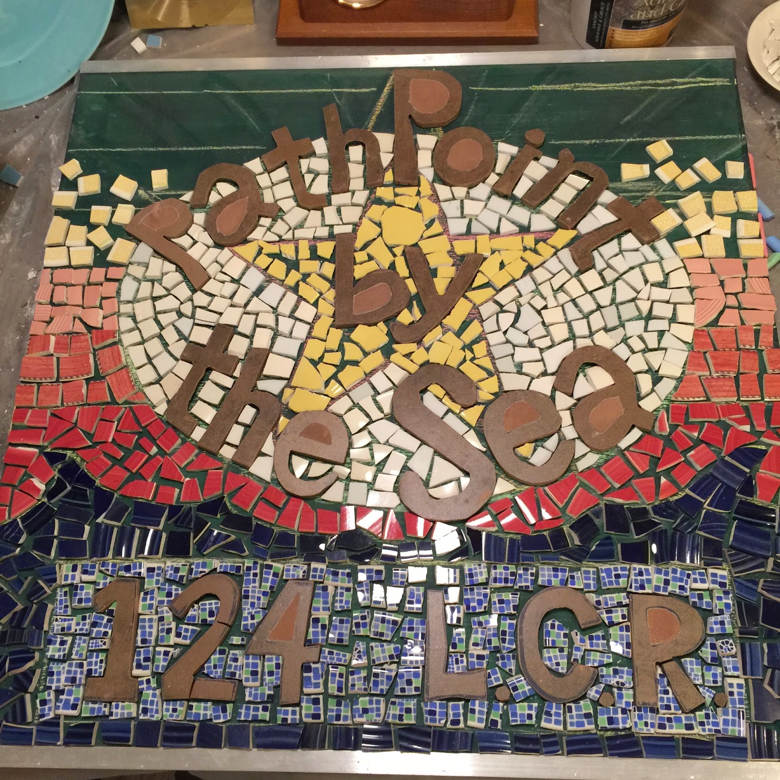

Finally, I grouted the piece in white, and applied the eye-bolts. I then added some more silicone to the top seam to divert moisture, and sealed the entire piece, front and back, with professional grade sealer. I also added a bit of acrylic paint to the interiors of the letters, which will certainly wear over time, adding a nice patina of age that seems appropriate.


So now you know how a double-sided mosaic sign is made and you can order one for yourself. It probably won't take me two years to make another one. Probably.
No comments:
Post a Comment